 Рус
 Հայ

Context
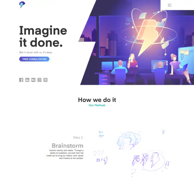
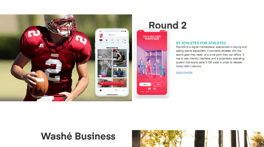
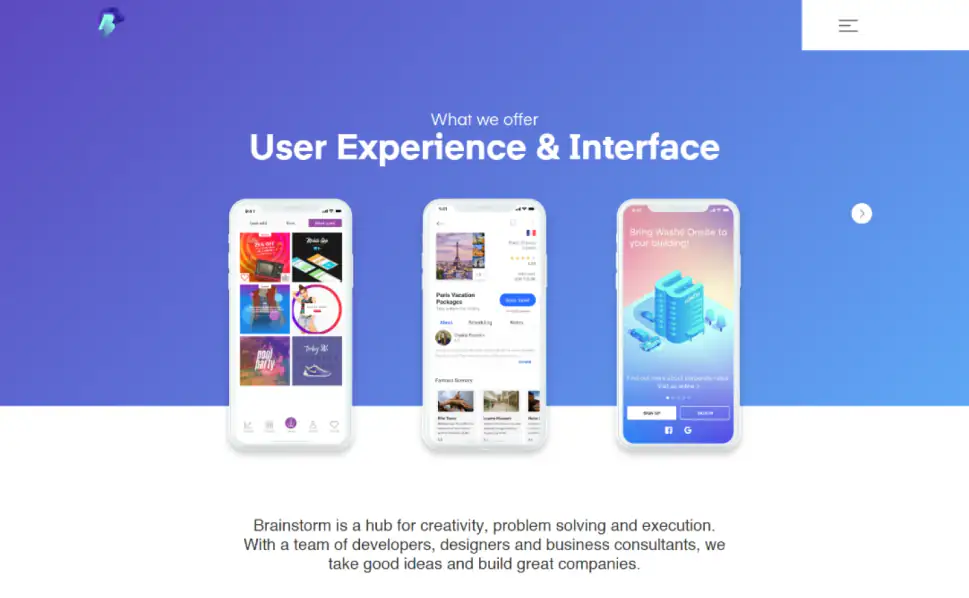
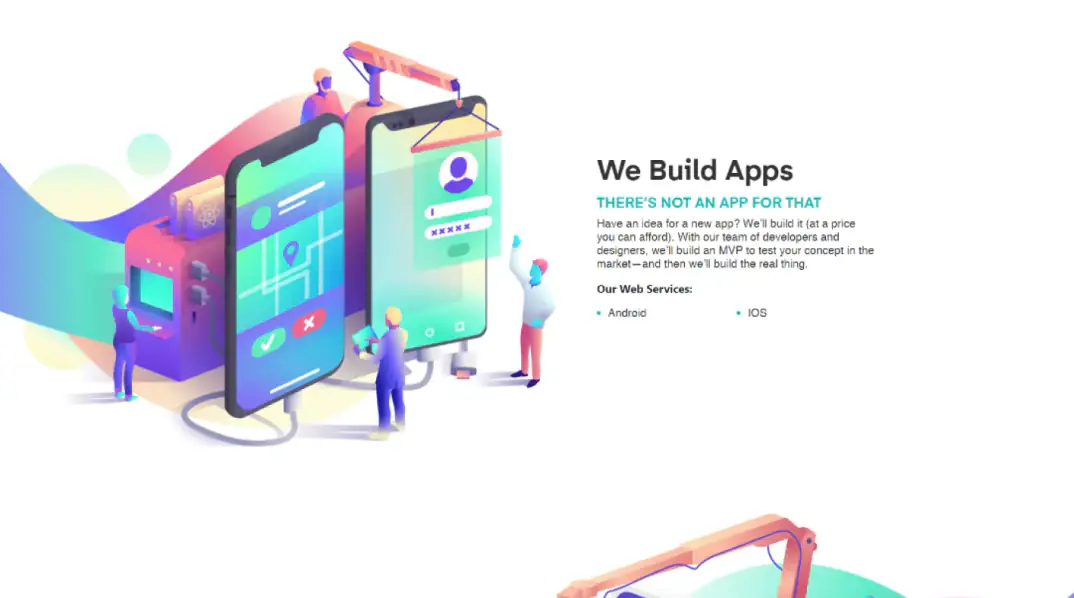
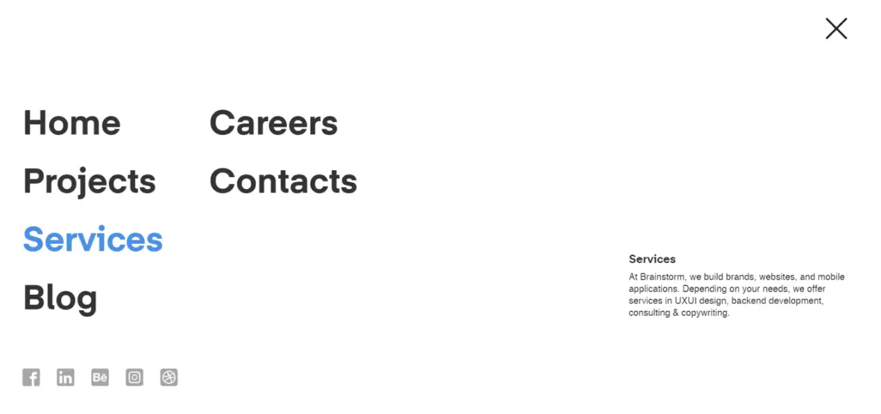
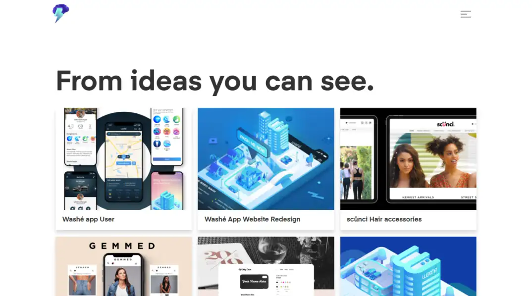
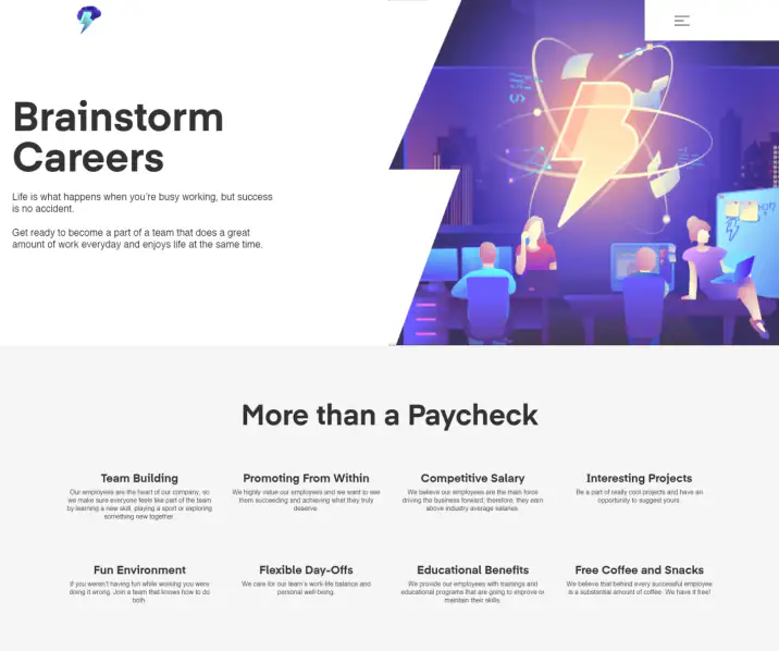
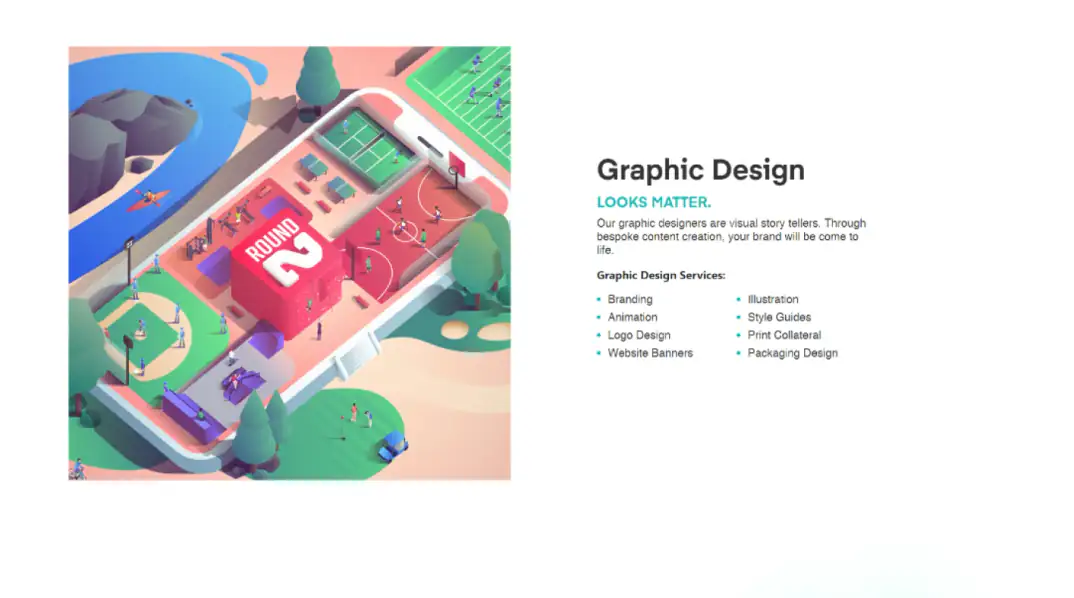
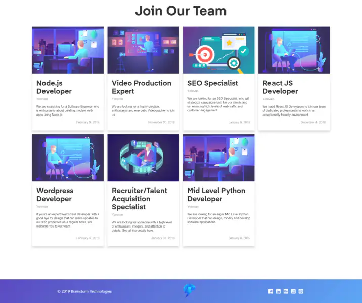
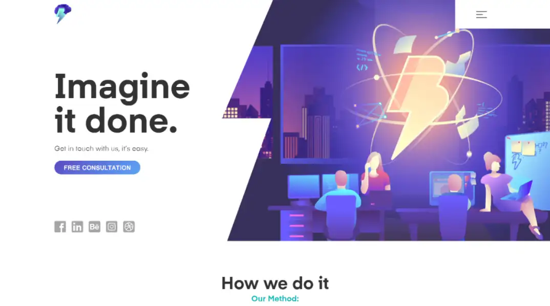
The agency’s own website, with the design still being developed and refined as the front end was built.
Custom front-end and scroll-driven interaction work for Brainstorm’s agency website
It began in 2018 as an outsourced assignment: building Brainstorm’s own agency website while its design was still being developed.
I built the website UI in HTML, CSS and vanilla JavaScript, with custom animation and hand-written scroll-event logic. The finished site led Brainstorm to invite me onto its team, where I went on to work on client stores - those are separate projects.
Brainstorm needed its own site built while the design was still taking shape.
The agency’s own website, with the design still being developed and refined as the front end was built.

Working directly with the design as it changed, rather than waiting for a final version.

Every layout implemented and made responsive, in step with the visual concept.

Animation built as part of the experience, not added on top of it.
Scroll-driven events and transitions, coded by hand in JavaScript rather than taken from generic animation templates.


How the site was built while its design was still moving.
Build directly against an evolving design.
Animation as a working part of the experience.
Scroll interactions controlled in code, not by templates.
Responsive behaviour kept true to the visual idea.
Two parts of the work, and how each was approached.
The site’s animation and interactions are driven by scrolling.
Rather than relying on generic animation templates, I implemented the JavaScript event behaviour myself, so each page animates the way it was meant to.
The designs were still evolving while the front end was underway.
Building in step with them meant the finished site matched the final design, not an early draft of it.
Tell me what you’re building. I reply within 2 business days.
A new website, a product interface, a design system, or improving what’s already live.
Previous and next projects.