 Eng
 Рус
Context
Acentecom is a house of brands, not an agency: brand, creative, product, media and technology are all in-house. The funnels are where its brands make their sales.
Sales funnels for a house of direct-to-consumer wellness brands
From March to July 2026 I worked in Acentecom’s Product & Tech team as a Senior E-commerce Developer. Acentecom builds and runs its own wellness brands, and every brand sells through its own funnels.
I built the front end of those funnels: landing and sales pages, checkout, upsells and post-purchase pages, from Figma designs and templates, on Shopify and CheckoutChamp.
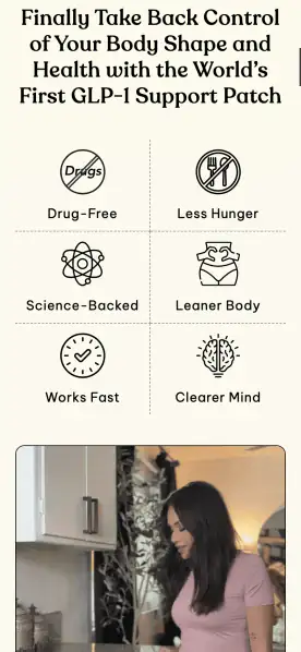
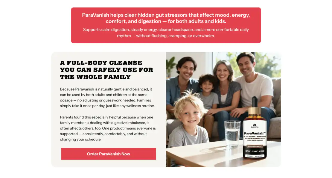
Each brand – hair care, a GLP-1 patch, drainage drops, a gut cleanse, joint chews for dogs, skin balms – sells through its own funnel. Pages are built, tested and replaced often, so speed mattered as much as precision.
Acentecom is a house of brands, not an agency: brand, creative, product, media and technology are all in-house. The funnels are where its brands make their sales.

Complete customer journeys, page by page:

Figma designs, copy, images and templates turned into responsive pages, on phone first, since most visitors arrive there.

Offer blocks with bundles, subscriptions and limited-time discounts, wired into the checkout on CheckoutChamp so each choice reaches the cart correctly.

Custom quizzes and interactive funnel steps where a brand needed them, so a visitor’s answers shape what they’re offered.

A/B tests and funnel experiments set up and supported. Before every release, responsiveness, checkout behaviour and funnel logic checked on phone and desktop.


What every funnel page held to.
Most visitors arrive on a phone; every page was built and checked there first.
Every offer and option reaches the cart exactly as shown.
Offer, journey, comparison, proof and FAQ blocks shared across brands.
Pages structured so sections and variants can be swapped for A/B tests.
AI speeds up the work; a person still reads, tests and fixes the code.
Six parts of the work, and how each was approached.
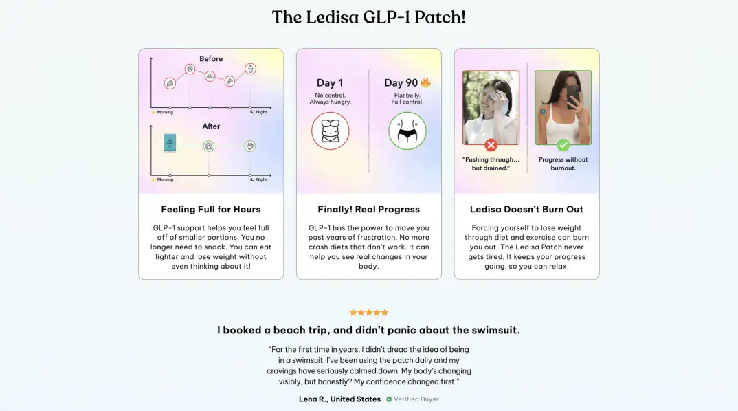
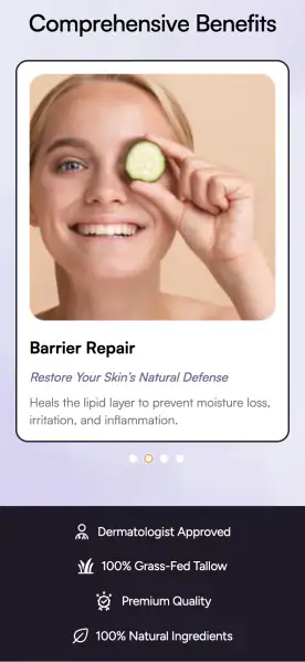
Hair care, patches, drops, chews and balms share the same funnel sections: offer, journey, comparison, reviews and FAQ.
Each brand changes the colours, type and imagery; the structure underneath stays the same, so a new brand page starts from working parts.

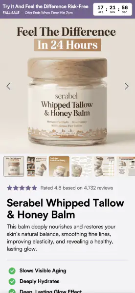
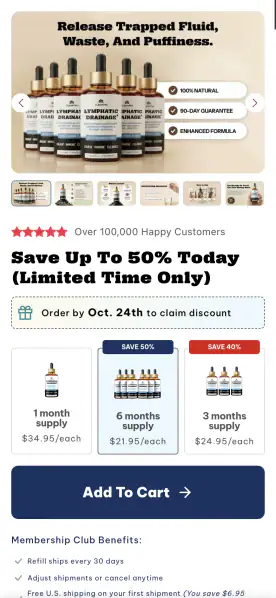
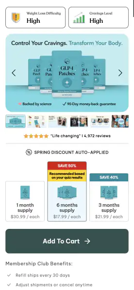
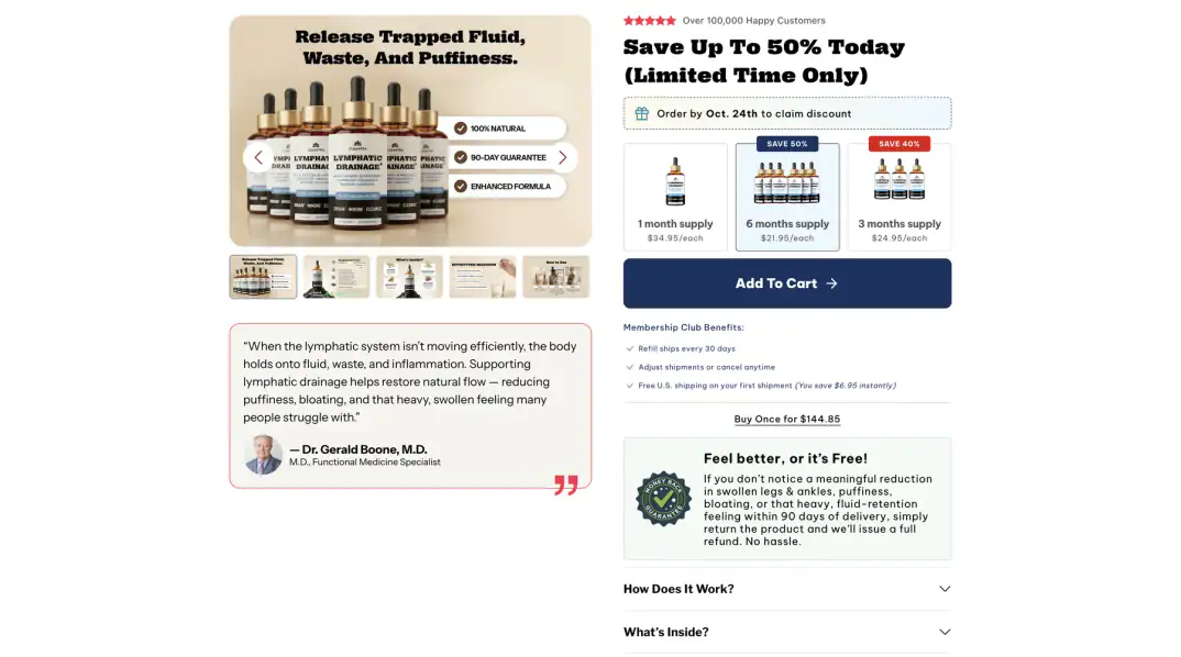
The part of the page that sells: bundle sizes with per-unit prices, subscribe-and-save, a discount deadline and the add-to-cart button.
Built to read at a glance on a phone and to pass the chosen bundle straight into checkout.
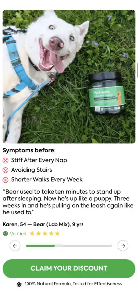
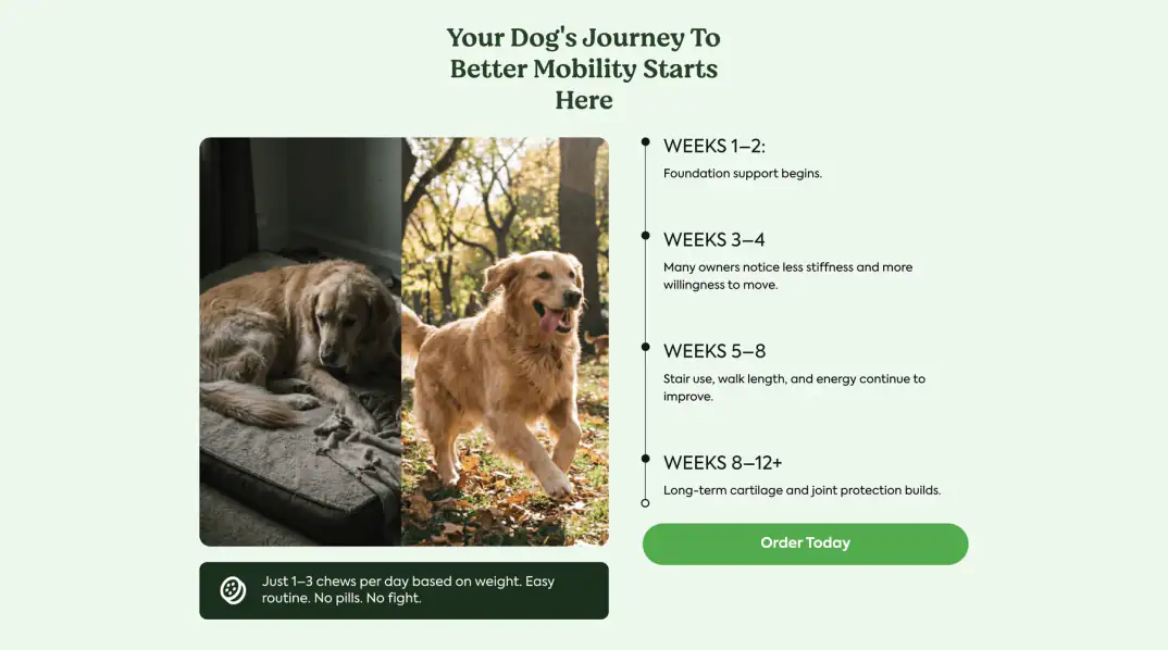
On the dog chews, the visitor picks their dog’s weight and a plan, and the offer updates to match.
The same pattern carries over to quizzes: a few questions, then the product and plan that fit.
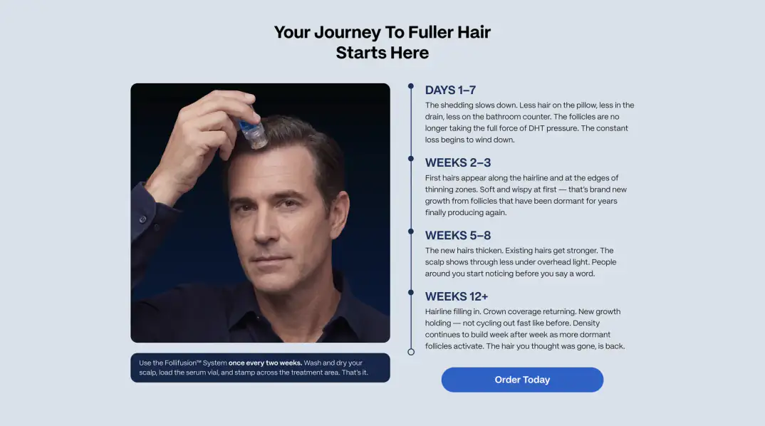
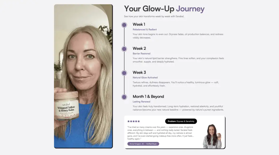
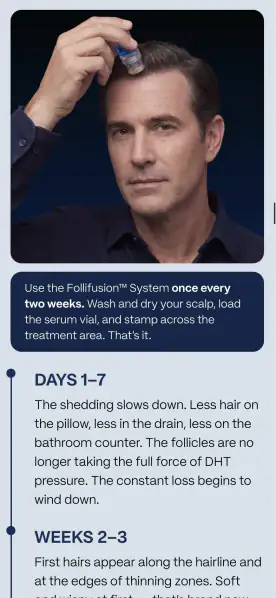
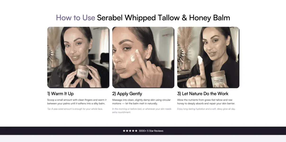
Week-by-week journeys, ingredient lists and how-to steps carry a lot of copy.
Laid out as timelines and steps with images beside them, so they read in seconds on a phone.
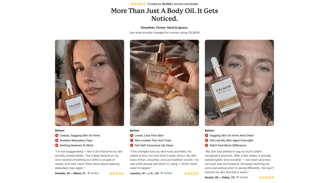
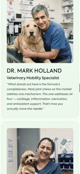
Comparison tables, survey results, expert quotes and customer reviews, built as modules a page can add, remove or reorder.
Each one lays out cleanly from desktop down to the narrowest phone.

Variants of headlines and sections set up for A/B tests, and every release checked for responsiveness, checkout behaviour and funnel logic.
AI tools drafted code faster; every change was still reviewed and tested by hand before it went live.

Պատմեք՝ ինչ եք ստեղծում։ Կպատասխանեմ երկու աշխատանքային օրվա ընթացքում։
Նոր կայք, պրոդուկտի ինտերֆեյս, դիզայն համակարգ կամ գործող լուծման բարելավում։
Նախորդ և հաջորդ նախագծերը։